JLL (Jones Laing LaSalle)
Global Creative Director
Crafting JLL's Distinctive Brand Identity: A Journey of Innovation and Impact
JLL, a global leader in property consultancy and investment management, embarked on a transformative journey to unify its brand presence across regions, connect with target audiences, and drive business growth. As the business expanded rapidly to meet evolving client needs, a new brand strategy was essential to foster cohesion and resonance. My role was to lead the brand refresh and develop a creative solution complete with guidelines to ensure consistency across markets.
Crafting a Cohesive Brand Experience
To better understand the challenges, I conducted a comprehensive audit of JLL's existing brand identity. Using data and insights from an internal survey, I planned the strategic and creative execution to elevate the brand's presence. Through meticulous collaboration and attention to detail, I crafted a cohesive visual language that aligned with the core brand idea: "SEE A BRIGHTER WAY."


The Design Strategy
The Logo
We retained the existing logo, recognising its strong market presence and connection with the audience. Given the updates to the other visual elements, it was important not to disrupt this established recognition. Additionally, a logo lock-up was introduced to highlight the brand idea. This version was developed in both a horizontal and vertical format to accommodate different use cases.
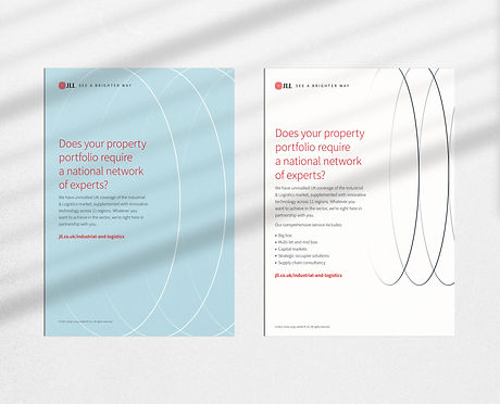
Colour Palette
Known as the 'red' brand in the real estate industry, we decided to retain it for recognition. The remaining core colour palette was updated to introduce lighter tones to reflect the brand idea, "SEE A BRIGHTER WAY". The flexible palette was tested to maximise legibility with Accessibility Standards complete guidance on usage. A secondary palette was designed for data visualisation, using bright tones to reflect the strategy which also considered accessibility.

Typography
We selected a modern typeface to align with the contemporary approach we aimed to achieve. By choosing a typeface available in all languages, we ensured a consistent identity across global markets. A secondary font was introduced for decorative purposes.


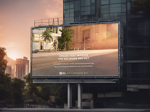
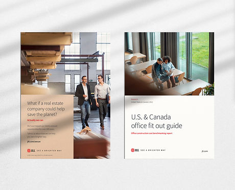
Photography
To diffrentiate ourselves in the market, we commissioned original images to reflect our brand idea whilst capturing themes to enhance the company’s offering: People, Sustainability, Technology, Architecture, Places, and Locations. The tones within the images were aligned with our core palette to enhance visual recognition.


Brand Pattern
A unique pattern 'Solar' was developed to replicate the worldmark in the logo, creating a differentiator among competitors and aiding brand recognition.
Brand Shape
Introducing a rectangle as a brand shape 'Radiant' allowed teams to apply it flexibly to various applications, aiding legibility while maintaining consistency across diverse outputs.

Iconography
An extensive library of icons was introduced to accommodate all use cases. Using a thin line weight ties in with the font weight, maintaining a sophisticated feel.
Illustration
Illustrations are an active part of the brand language that tells informative and engaging stories consistently and intelligently. The line weight of these illustrations was matched to the icon style to create a uniform look.

Creative Framework & Brand Guidelines
The development of our compelling brand idea was aimed at inspiring reappraisal, uniting the organisation, and driving global business growth. Collaborating closely with stakeholders, I ensured alignment with organisational objectives and guided the development of a new messaging hierarchy, creative framework, and visual identity. To drive consistency and impact across touchpoints, I partnered with various teams to develop comprehensive brand guidelines, including the Brand Playbook, Visual Brand Guidelines, Tone of Voice, Copy Style Guide, and Strategic Naming Guide for products, services, and programs whilst embedding the brand idea.
A Global Launch with Local Sensitivity
The launch debuted at Times Square before rolling out across digital, campaign and physical channels globally — marking a significant shift in how JLL showed up in the world.

Events & Experiential
Alongside the global rollout, I directed the creative and experiential design for major international industry events including MIPIM — overseeing all collateral, environmental design and client experience touchpoints to ensure the brand showed up with consistency and impact on the world stage.


The Launch & Impact
The brand launched globally, debuting at Times Square, New York, and rolling out across 20+ international markets. The new identity unified expression across 400+ in-house creatives and agency partners, with measurable improvements in brand perception and consistency across regions.